We recently ran a marketing tactics course for small business and startups and the first part focuses on brand - how your brand is important and how you need to assess each and every touch point between you and your customers to ensure that your brand is consistently represented.
Which means that it has to be consistent to build an identity, same sort of images, same fonts, logos, colours, and style. Same tone of voice across all media.
How the brand police (in big companies usually) - the people who say that it has to be in this colour, in this font, in this size - are as annoying as they are are extremely important.
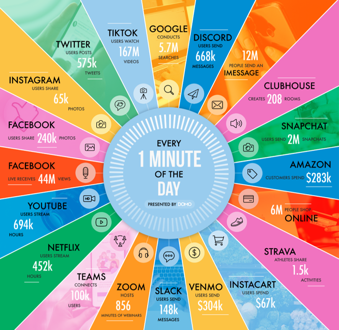
If you think about what goes on, online, in every minute of every day
- Google does at least 5.7 million searches
- You Tube stream 694,ooo hours of content
- Zoom hosts 856 minutes of webinars
- TikTok users watch 167m videos
it's clear that getting yourself noticed and recognised has never been more important or more of a challenge. You need to make sure that every contact between you and your customers is recognisable as you, that you are consistent, you use similar images, you use the same colours and the same fonts.
It's never been more important to have a consistent brand than now.
One key element of this is fonts and colours, and an understanding of how different colours mean different things, and how different fonts say different things is vital to supporting your brand.
So, as an example take the following simple, inoculous phrase:
I CAN SEE YOU

I Can See You
In this font it's fairly plain, it has little meaning, it's smooth, quite modern, simple, clean, and unfussy.
I Can See You
Now this is more romantic, the font is soft, gentle, and engaging.
I Can See You
This font is pretty young and simple, quite child friendly, and certainly not technological or particularly modern.
I Can See You
Perhaps a beer festival or Christmas market?
I Can See You
This looks pretty scary - not the sort of message you'd want to see written in the condesation on your bathroom mirror.
I Can See You
Perhaps the punchline to a joke?
I Can See You
This font suggests something old fashioned and traditional, quite formal and even perhaps a bit boring.
I Can See You
It must be something, but I have no idea what you might used this font for.
Of course this does not take into account how hard it is to read. If a font is harder to read people tend to think that the subsequent action will be harder to do. However, if you want people to concentrate or take in difficult information, sometimes putting it into a more difficult font makes them concentrate more.
